Trail running is a $20B industry, yet runners bounce between 4–5 fragmented tools to research a single race. Existing directories have data but zero design quality. Elevation profiles are Excel screenshots. Course maps are afterthoughts. No platform merges comprehensive race data with editorial-quality content and AI-personalized insights.
"Build the largest, highest-quality trail race directory globally — then layer AI-personalized training intelligence on top, using Trailline's unique course data to generate trail-specific preparation that no road-running platform can match."
This isn't a content site with a database. It's a vertically integrated product where every layer — data ingestion, content generation, image creation, quality scoring, and eventually personalized training — is designed and orchestrated as a single system.
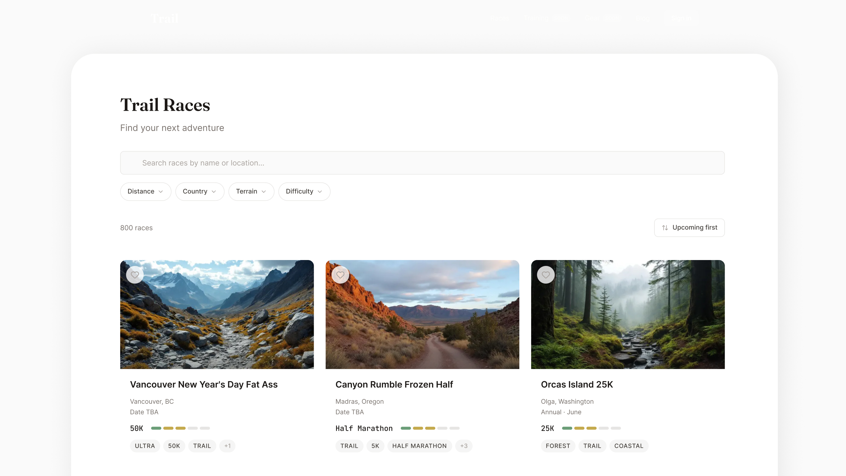
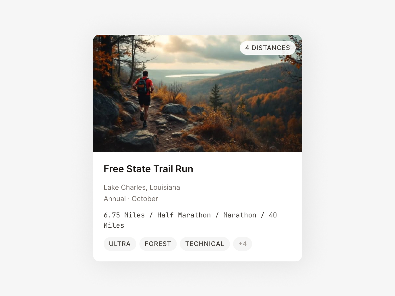
Editorial magazine quality, not fitness app noise. I built a complete design system from scratch: warm stone palette with teal accents, Fraunces serif + Inter sans-serif pairing, color-coded elevation grades, and a topographic visual language that runs through every component.
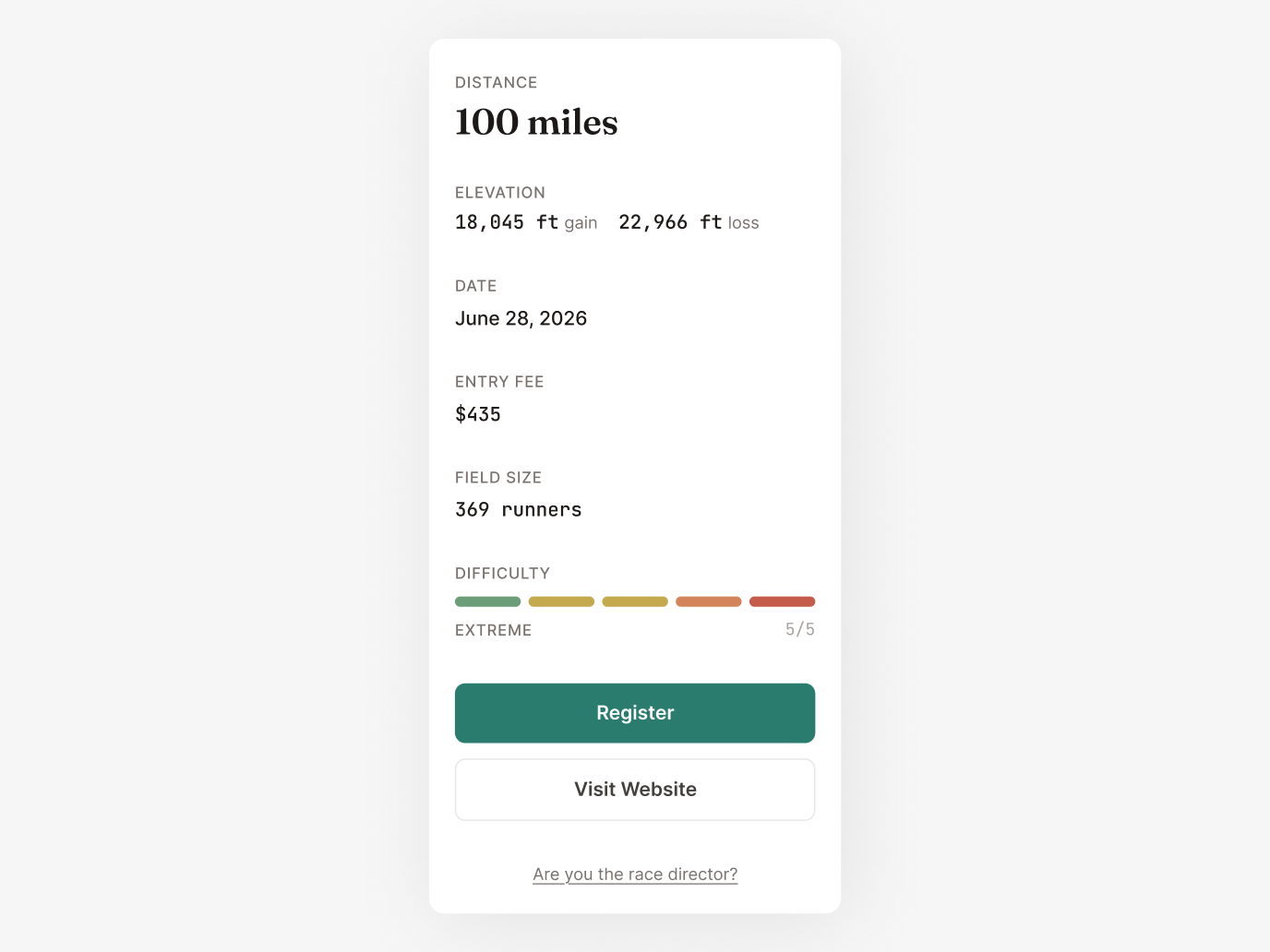
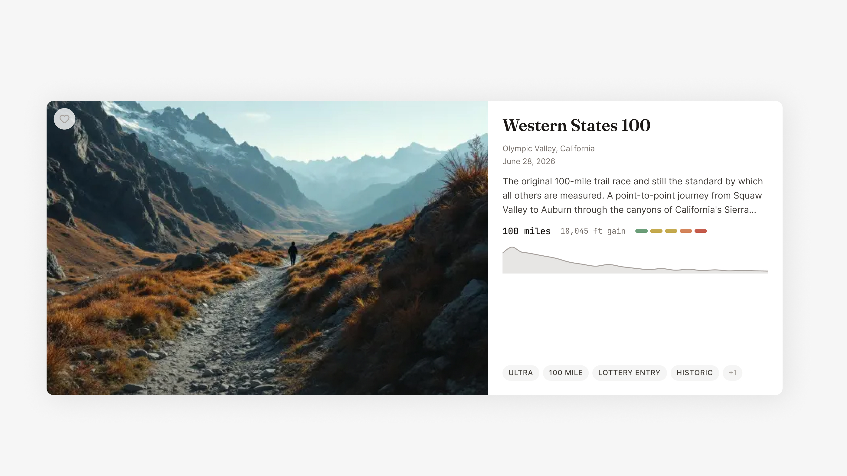
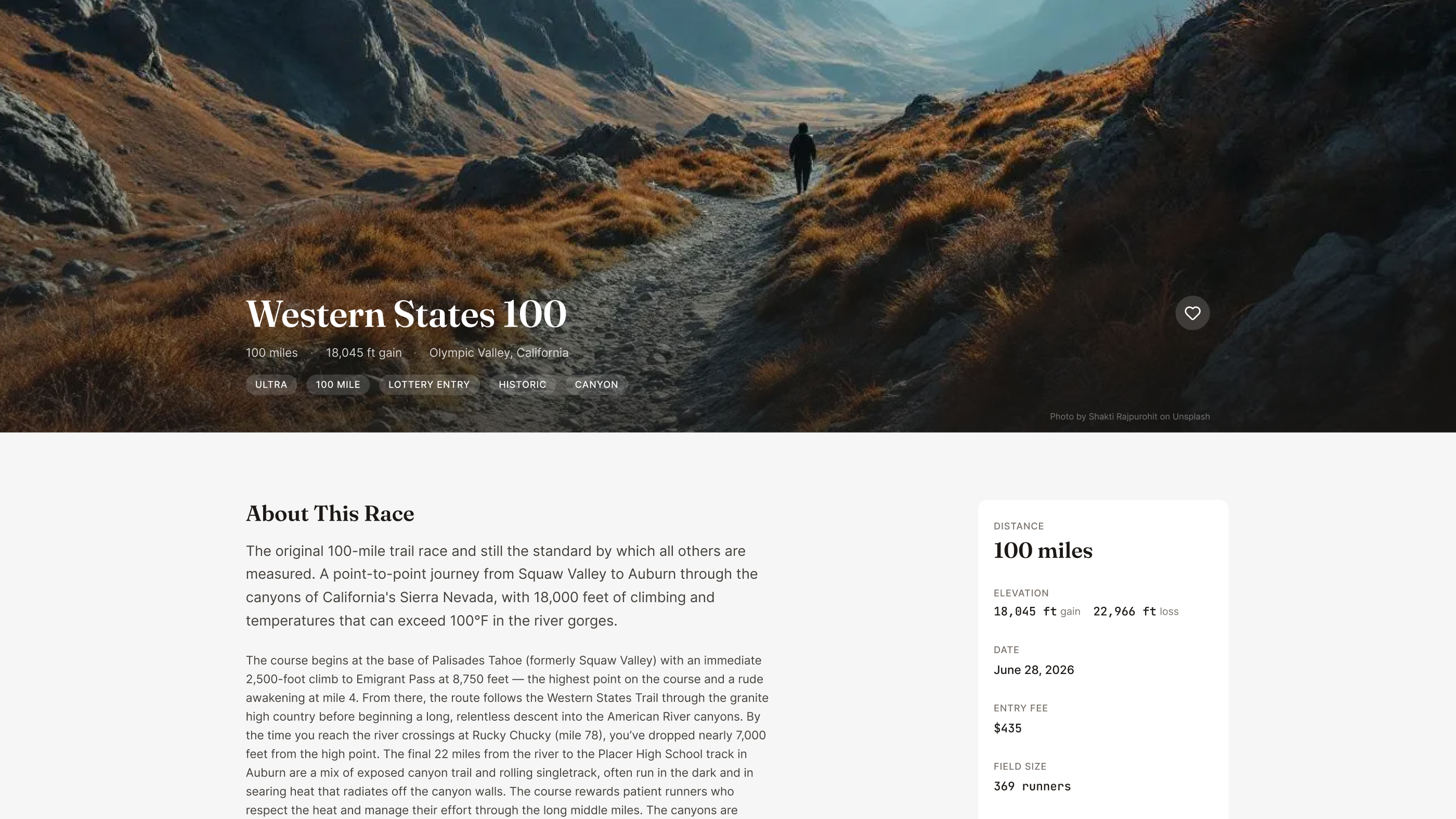
D3.js charts color-coded by gradient steepness with aid station markers and hover tooltips. This is the single most important feature for trail runners evaluating a race — and no competitor has interactive elevation profiles at scale. I designed the color system to make gradient difficulty instantly scannable: green for flat, amber for moderate, red for steep.
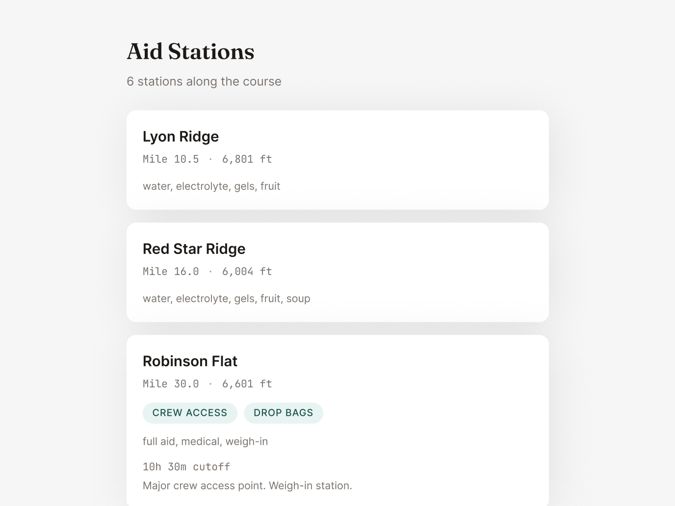
Topographic-styled course routes with custom Mapbox outdoor styling that matches the Trailline brand. Each map renders the actual GPX course data with terrain context, giving runners a real sense of the landscape.
This is where design meets engineering meets AI systems thinking. The core product challenge: how do you generate thousands of premium, editorial-quality race listings — each with rich descriptions, hero images, elevation data, and structured metadata — with a single person? You design an automated pipeline where AI is the content team, and you're the creative director and quality engineer.
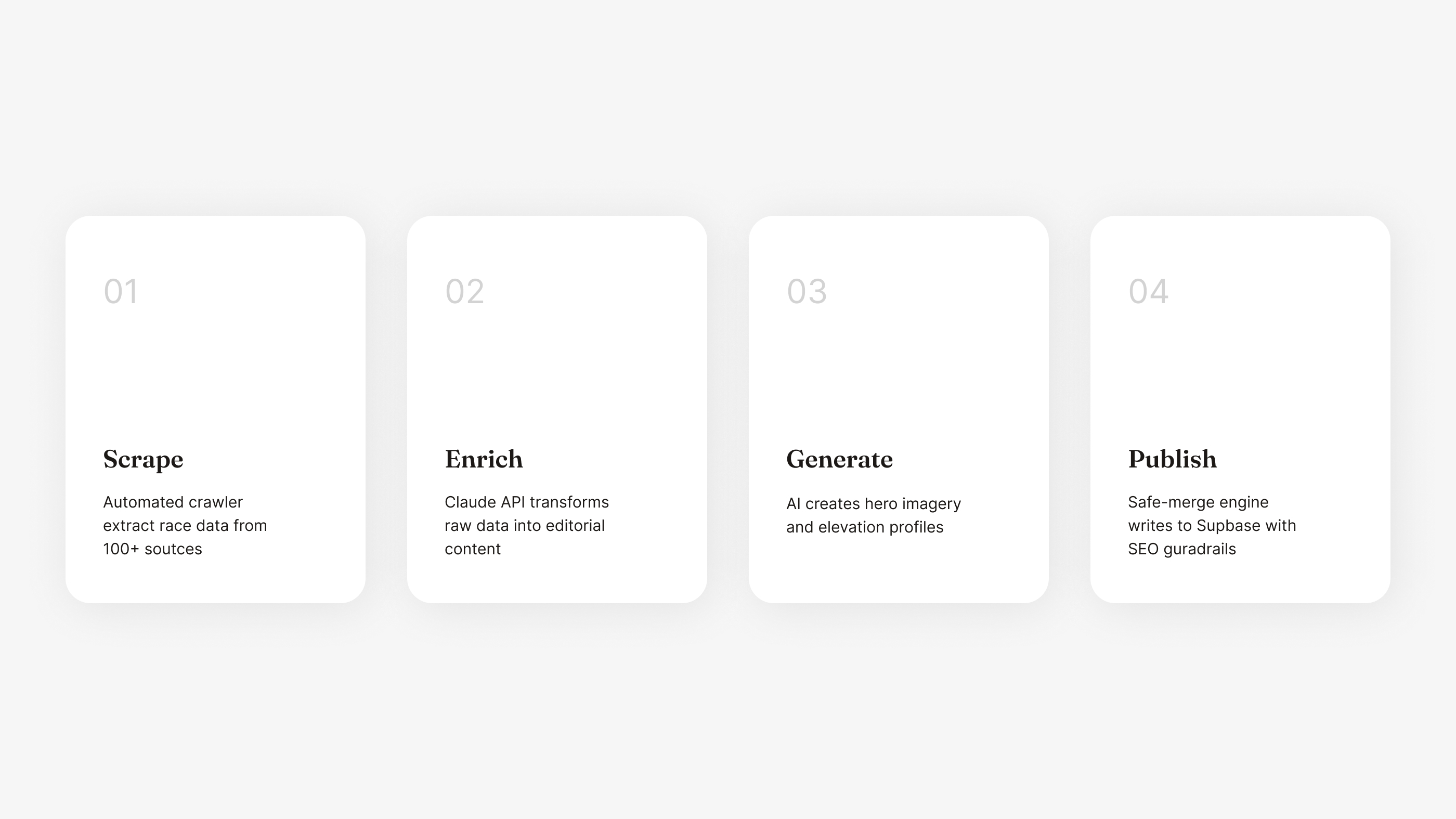
Python scrapers built with Playwright and BeautifulSoup pull race data from ITRA and UltraSignup on a weekly schedule via GitHub Actions. The scrapers handle pagination, rate limiting, and incremental updates — only processing races that have changed since the last run.
This is where raw data becomes product. Claude API transforms bare race records into editorial-quality descriptions tuned to Trailline's brand voice. Each enrichment call includes terrain analysis, difficulty characterization, structured metadata extraction, and SEO-optimized content — all governed by detailed system prompts I designed and iterated over dozens of cycles. The prompts are the product design of the AI layer.
I think of prompt design as interaction design for AI. The same principles apply: clear constraints, consistent voice, predictable outputs, graceful handling of edge cases. My prompts include few-shot examples, output schemas, tone calibration, and fallback instructions for incomplete data.
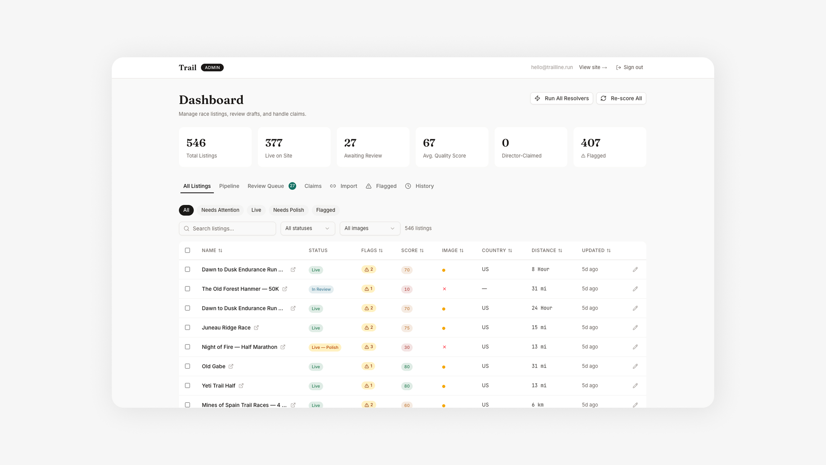
Every race gets scored 0–100 across 15+ completeness fields — does it have coordinates, a description, elevation data, an image, valid dates? High-scoring races auto-publish. Low-scoring races get flagged with specific, actionable issues. This is quality design applied to data operations.
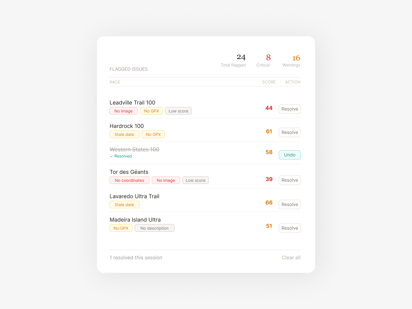
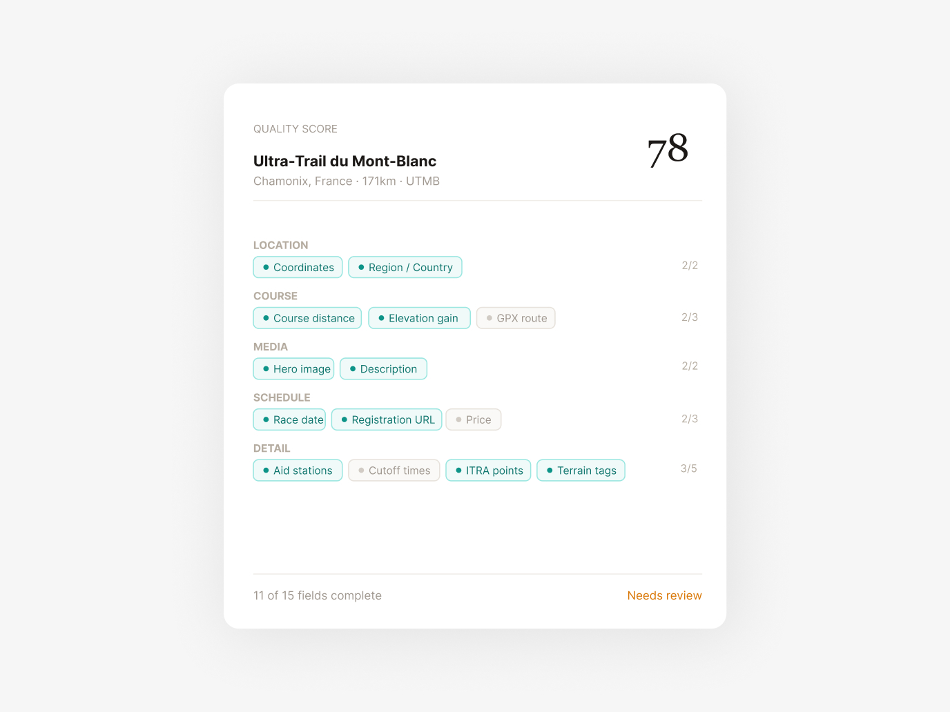
The admin dashboard is a product in itself. Each flagged race shows exactly what's missing and offers one-click AI-powered resolution: auto-geocode from location text, generate a hero image, re-enrich the description with more context, refresh stale dates, or split multi-distance events into separate listings. I designed the UX so that reviewing 50 races takes minutes, not hours.
With thousands of races and no photo library, I built an image generation pipeline using Replicate Flux Pro. Each prompt is dynamically constructed from the race's terrain type, geographic region, and a deterministic mood system — lighting condition, season, weather, camera angle — seeded per race to prevent the visual sameness that plagues AI-generated content.
The system is protected by an image source hierarchy: manual photo → Flux AI → curated library → Unsplash → gradient fallback. A merge engine ensures AI-generated images never overwrite higher-quality manual uploads. This kind of defensive design thinking is critical when you're automating creative decisions at scale.
The elevation pipeline uses a cascading data strategy to maximize coverage without sacrificing honesty:
Tier 1: Real GPX — Files sourced directly from official race websites. The gold standard.
Tier 2: Fuzzy-Matched GPX — Matched from trail databases using name similarity, country matching, and distance validation within tolerance.
Tier 3: Synthetic Profiles — Generated from Mapbox Terrain-RGB tiles when no GPX exists, always with a transparency disclosure badge on the UI.
Each tier has different confidence levels, and the UI communicates this honestly. Designing for data transparency — showing users what's verified vs. estimated — is a trust pattern I've applied across my web3 work too.
Every automated resolver runs with dry-run previews, token budget guards, streamed progress monitoring, and protected merge rules. Descriptions can't shrink below their current length. Images can't be downgraded in source quality. Published URL slugs can never change. I built these guardrails after learning the hard way that batch AI operations need blast-radius protection from day one. This is the same operational safety thinking that matters in any product at scale — web3 or otherwise.